Integrating Custom UI
This feature and the API used by this feature are in a pre-release phase. We do not guarantee quality at this time, so please use it at your own risk. Also, please note that these specifications may change without notice.
Overview
In addition to the UI included as standard in Next Design, you can extend the model editing functionality by integrating your own custom-developed UI into the following parts:
- Editor
- Navigator
- Inspector
To integrate a custom UI, the following implementation and procedures are required:
- Implementation of user controls for the custom UI
- Implementation of the interface for the custom UI
- Implementation of registration and unregistration processes for the custom UI
- How to use the custom UI
Custom UIs are implemented according to the MVVM model (Model-View-ViewModel) architecture.
Implementing User Controls for Custom UI
In the View class, implement the user control to be displayed as a UI using WPF.
This feature provides a means to incorporate custom UIs.
Please note that it does not provide functionality to assist in creating the user control itself.
Implementing Interfaces for Custom UI
In the ViewModel class, implement the interface according to the type of UI.
By implementing the interface according to the type of UI, you can connect the Next Design model and the ViewModel class.
- UI Type and Interface to Implement
| UI Type | Interface to Implement in ViewModel | Required Properties/Methods |
|---|---|---|
| Custom Editor | ICustomEditorView | Descriptor Property OnInitialized Method OnBeforeDispose Method ViewDefinitionId Property SelectedItem Property SelectedItems Property SetModel Method GetDocumentContent Method [*1] |
| Custom Navigator | ICustomNavigator | Descriptor Property OnInitialized Method OnBeforeDispose Method SelectedItem Property SelectedItems Property OnShow Method OnHide Method |
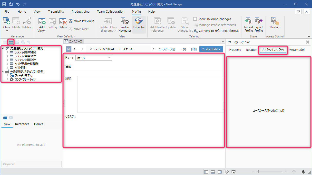
| Custom Inspector | ICustomInspector | Descriptor Property OnInitialized Method OnBeforeDispose Method SetModel Method |
[*1]: The GetDocumentContent method is an API provided for future feature enhancements. In the current version, please return only null.
- When selecting elements within a custom UI, specify the selected element as an argument to the IWorkspaceState.SetInspectedObjects method to set it as the element to be inspected.
Implementing Custom UI Registration and Deregistration Processes
Implement the custom UI registration process in the Activate method, a public method of the main class that implements IExtention. Then, implement the custom UI deregistration process in the Deactivate method, also a public method of the main class.
- APIs used for registration
| Target | API for registering custom UIs |
|---|---|
| Custom Editor | RegisterCustomEditor |
| Custom Navigator | RegisterCustomNavigator |
| Custom Inspector | RegisterCustomInspector |
- Type Descriptor specified during registration
The type descriptor defines the static information of the custom UI.
| Custom UI | Type Descriptor | Information to Define |
|---|---|---|
| Custom Editor | CustomEditorDescriptor | ID CustomEditorDefinitionDescriptor |
| CustomEditorDefinitionDescriptor | ID Access Key Display Name Group Name Icon | |
| Custom Navigator | CustomNavigatorDescriptor | ID Display Name Display Position Icon |
| Custom Inspector | CustomInspectorDescriptor | ID Display Name Display Position |
How to Use Custom UIs
Editor
If the custom UI type is an editor, add the custom UI to the target model's view using the following steps:
-
Select the target model for the custom UI in the Model Navigator.
-
Execute [Add View] from the context menu.
-
Select the editor name of the embedded custom UI and add the view.
-
Switching to the added view allows you to view and edit the target model with the embedded custom UI.
Navigator, Inspector
If the custom UI type is a navigator or inspector, the UI will be displayed in the corresponding window, allowing for direct operation.
Sample: Adding a Custom Editor/Navigator/Inspector
As a sample of custom UIs, we will add a custom editor/navigator/inspector that displays different content from the UI built into Next Design by default.
The following explains the process from creating a new Visual Studio project to actually integrating a custom UI.
Overall Flow
- Create a new Visual Studio project
- Add a custom editor
- Implement user controls
- Implement interfaces
- Add a custom navigator
- Implement user controls
- Implement interfaces
- Add a custom inspector
- Implement user controls
- Implement interfaces
- Implement custom UI registration and unregistration processes
- How to use the custom UI
Public Sample
- The complete source code for the sample created using the following steps is available on GitHub.
External Link: CustomUISample
Goal Image
-
A custom navigator is added to the navigator, allowing you to select models with your own UI.
-
A custom editor is added to the view types, allowing you to switch the model editor view to the custom editor and view and edit models with your own UI.
-
A custom inspector is added to the inspector tab, allowing you to view and edit detailed information about the model being edited with your own UI.
Creating a New Visual Studio Project
Create a new Visual Studio project referring to the following page:
However, to allow the placement of user controls, set the project type to [WPF Class Library] when creating the new project.
Note that when adding initialization processing during model addition, the following definition is not required in the manifest:
- UI extension point definition (ribbon tabs, groups, buttons)
- Command extension point definition
Implementation Example
manifest.json
{
    //Extension definition
    "name": "DensoCreate.NextDesign.Extensions.CustomUISample",
    "displayName": "%Extension.DisplayNameKey%",
    "description": "%Extension.DescriptionKey%",
    "version": "1.0.0",
    "publisher": "DENSO CREATE Inc.",

    "license": "Requires the same license as the Indio main application.",

    "env": {
        "nextdesign": "1.1.0", //Corresponding Next Design version

        "engine": {
            "engine": "dotnetdll", //"clearscript" , "dotnetdll"
            "version": "^0.9.0"

        }
    },

    "main": "CustomUISample.dll", //Specifies the DLL file name of the build result as the entry point.
    "lifecycle": "application", //Specifies the application lifecycle as the lifecycle.
    "baseProfile": "" //Does not specify any profile name conditions.
}
Creating Class Files
Add the View class and ViewModel class required to add the custom UI to your Visual Studio project.
View Class
In the Visual Studio Solution Explorer, select User Control (WPF) as a new item in your project.
ViewModel Class
In the Visual Studio Solution Explorer, add a class as a new item in your project.
The class name to be added is as follows:
| UI Type to Add | View Class | ViewModel Class |
|---|---|---|
| Custom Editor | CustomEditor | CustomEditorViewModel |
| Custom Navigator | CustomNavigatorViewModel, CustomNavigatorItemViewModel(*) | |
| Custom Inspector | CustomInspector | CustomInspectorViewModel |
- : CustomNavigatorItemViewModel is the class for display elements shown within the custom navigator.
Project File Structure
The Visual Studio project structure after adding files will be as follows:
CustomUISample/
    CustomUISample.sln
    CustomUISample/
        CustomUISample.csproj
        manifest.json
        View/
          Editor/
            CustomEditor.xaml
            CustomEditor.xaml.cs
          Inspector/
            CustomInspector.xaml
            CustomInspector.xaml.cs
          Navigator
            CustomNavigator.xaml
            CustomNavigator.xaml.cs
        ViewModel/
          Editor/
            CustomEditorViewModel.cs
          Inspector/
            CustomInspectorViewModel.cs
          Navigator
            CustomNavigatorItemViewModel.cs
            CustomNavigatorViewModel.cs
        CustomUISampleEntryPoint.cs(*)
(*) : CustomUISampleEntryPoint is the main class that implements the IExtension interface.
Adding a Custom Editor
Implementing the User Control
Define the view for the custom editor.
Implementation example
CustomEditor.xaml
<UserControl x:Class="CustomUISample.View.Editor.CustomEditor"
xmlns="http://schemas.microsoft.com/winfx/2006/xaml/presentation"
xmlns:x="http://schemas.microsoft.com/winfx/2006/xaml"
xmlns:mc="http://schemas.openxmlformats.org/markup-compatibility/2006"
xmlns:d="http://schemas.microsoft.com/expression/blend/2008"
xmlns:local="clr-namespace:CustomUISample.View.Editor"
mc:Ignorable="d"
d:DesignHeight="450" d:DesignWidth="800">
<UserControl.Resources> <BooleanToVisibilityConverter x:Key="BooleanToVisibilityConverter"/>
</UserControl.Resources>
<Grid>
<Grid.RowDefinitions>
<RowDefinition Height="30"/>
<RowDefinition Height="40"/>
<RowDefinition Height="1"/>
<RowDefinition Height="*"/>
</Grid.RowDefinitions>
<Grid VerticalAlignment="Center" Margin="5,0">
<Grid.RowDefinitions>
<RowDefinition Height="Auto"/>
<RowDefinition Height="Auto"/>
</Grid.RowDefinitions>
<StackPanel Orientation="Horizontal">
<Label Content="View:"/>
<ComboBox Height="23" Width="150" Margin="5,0" >
<ComboBoxItem Name="m_FormItem" Content="Form" IsSelected="True"/>
<ComboBoxItem Name="m_GridItem" Content="Grid"/>
</ComboBox>
</StackPanel>
</Grid>
<StackPanel Grid.Row="1" Orientation="Horizontal" VerticalAlignment="Center" Margin="10,0">
<TextBlock Text="Name:"/>
<TextBlock Text="{Binding Path=Name}" Margin="5,0"/>
</StackPanel>
<Border Grid.Row="2" BorderThickness="0,1,0,0" BorderBrush="LightGray" HorizontalAlignment="Stretch"/>
<!--Form-like view-->
<Grid Grid.Row="3" Visibility="{Binding ElementName=m_FormItem, Path=IsSelected, Converter={StaticResource BooleanToVisibilityConverter}}" Margin="10,20,0,10">
<Grid.ColumnDefinitions>
<ColumnDefinition Width="50"/>
<ColumnDefinition/>
</Grid.ColumnDefinitions>
<Grid.RowDefinitions>
<RowDefinition Height="Auto"/>
<RowDefinition Height="30"/>
<RowDefinition Height="Auto"/>
</Grid.RowDefinitions>
<TextBlock Text="Description:" VerticalAlignment="Top" Margin="0,2,0,0"/>
<TextBox Grid.Column="1" Text="{Binding Path=Description}" MinHeight="150" HorizontalAlignment="Stretch"/>
<TextBlock Grid.Row="1" Text="Class name:" VerticalAlignment="Center"/>
<TextBlock Grid.Row="1" Grid.Column="1" VerticalAlignment="Center" Text="{Binding Path=ClassName}" Margin="5,0" HorizontalAlignment="Left"/>
</Grid>
<!--Grid View-->
<DataGrid Grid.Row="3" ItemsSource="{Binding Path=Children}"
Visibility="{Binding ElementName=m_GridItem, Path=IsSelected, Converter={StaticResource BooleanToVisibilityConverter}}"
AutoGenerateColumns="True" Margin="10,20,10,0"
HorizontalScrollBarVisibility="Auto"/>
</Grid>
</UserControl>
Interface Implementation
Implement ICustomEditorView in your custom editor's ViewModel class.
Implementation Example
CustomEditorViewModel.cs
using System;
using System.Collections.Generic;
using System.Text;
using System.Linq;
using NextDesign.Core;
using NextDesign.Desktop;
using NextDesign.Desktop.CustomUI;
using NextDesign.Extension;

namespace CustomUISample.ViewModel.Editor
{
    class CustomEditorViewModel : ICustomEditorView
    {
        #region type descriptor

        ///<summary>
        ///Type Descriptor
        ///</summary>
        private static CustomEditorDefinitionDescriptor s_DefinitionDescriptor;

        ///<summary>
        ///Type Descriptor
        ///</summary>
        public static CustomEditorDefinitionDescriptor DefinitionDescriptor
        {
            get
            {
                return s_DefinitionDescriptor ?? (s_DefinitionDescriptor = new CustomEditorDefinitionDescriptor
                {
                    //Custom editor type identifier
                    CustomEditorTypeId = "CustomUI.Test",
                    //Access key
                    AccessKey = "P",
                    //Display name
                    DisplayName = "Custom Editor",
                    //Group name
                    GroupName = "Custom Editor",
                    //Large icon. A string in pack-uri format or a Stream type can be specified.
                    LargeIcon =
                "pack://application:,,,/CustomUISample;component/Resources/Images/TestEditor32.png",
                    //Small icon. You can specify a string in pack-uri format or a Stream type.
                    SmallIcon =
                "pack://application:,,,/CustomUISample;component/Resources/Images/TestEditor16.png"
                });
            }
        }

        #endregion

        #region Properties

        ///<summary>
        ///Type Descriptor
        ///</summary>
        public ICustomDescriptor Descriptor { get; set; }

        ///<summary>
        ///Corresponding view definition ID
        ///</summary>
        public string ViewDefinitionId => Editor?.EditorDefinition.Id;

        ///<summary>
        ///The selected element in the editor.
        ///Implement this to return null if there are no selected elements.
        ///</summary>
        public object SelectedItem => null;

        ///<summary>
        ///Enumeration of the selected elements in the editor.
        ///Implement this to return an empty enumeration if there are no selected elements.
        ///</summary>
        public IEnumerable<object> SelectedItems => Enumerable.Empty<object>();

        ///<summary>
        ///Application
        ///</summary>
        public IApplication App { get; private set; }

        ///<summary>
        ///Extension
        ///</summary>
        public CustomUISampleEntryPoint Extension { get; private set; }

        ///<summary>
        ///Editor Information
        ///</summary>
        public ICustomEditor Editor { get; private set; }

        ///<summary>
        ///Target Model
        ///</summary>
        public IModel TargetModel { get; private set; }

        #endregion

        #region Event Handler

        ///<summary>
        ///Processing when initializing a user interface that you extend
        //Next Design calls this method when initializing a user interface that you extend.
        //If there is any processing that you want to execute during initialization on the extension side, implement it here.
        //</summary>
        //<param name="args">Event parameters</param>
        public void OnInitialized(InitializedEventArgs args)
        {
            // Remembers application and extension information
            App = args.App;
            Extension = args.Extension as CustomUISampleEntryPoint;
        }

        //<summary>
        //Processing before destroying a user interface that you extend
        //Next Design calls this method before destroying a user interface that you extend.
        //If there is any processing that you want to execute before destruction on the extension side, implement it here.
        ///</summary>
        ///<param name="args">Event parameters</param>
        public void OnBeforeDispose(BeforeDisposeEventArgs args)
        {
            //No processing before disposing
        }

#endregion

        #region Interface Implementation

        ///<summary>
        ///Sets the model this editor will display.
        ///</summary>
        ///<param name="model"></param>
        public void SetModel(ICustomEditor model)
        {
            Editor = model;
            TargetModel = model.Model;
        }

        ///<summary>
        ///Gets the content to be output to the document.
        ///</summary>
        ///<param name="context"></param>
        public ICustomEditorDocumentContent GetDocumentContent(ICustomEditorDocumentGenerationContext context)
        {
            //In the current version, this is fixed to null.
            return null;
        }

        #endregion
    }
}
Adding a Custom Navigator
Implementing the User Control
Define the view for the custom navigator.
Implementation example
CustomNavigator.xaml
<UserControl x:Class="CustomUISample.View.Navigator.CustomNavigator"
             xmlns="http://schemas.microsoft.com/winfx/2006/xaml/presentation"
             xmlns:x="http://schemas.microsoft.com/winfx/2006/xaml"
             xmlns:mc="http://schemas.openxmlformats.org/markup-compatibility/2006"
             xmlns:d="http://schemas.microsoft.com/expression/blend/2008"
             xmlns:local="clr-namespace:CustomUISample.View.Navigator"
             xmlns:viewModel="clr-namespace:CustomUISample.ViewModel.Navigator"
             mc:Ignorable="d"
             d:DesignHeight="450" d:DesignWidth="800">
    <UserControl.Resources>

        <Style TargetType="{x:Type TreeViewItem}">
            <Setter Property="OverridesDefaultStyle" Value="False"/>
        </Style>

        <HierarchicalDataTemplate DataType="{x:Type viewModel:CustomNavigatorItemViewModel}" ItemsSource="{Binding Path=Children}">
            <StackPanel Orientation="Horizontal">
                <Image Source="{Binding Path=Icon}" Height="16" Width="16"/>
                <TextBlock Text="{Binding Path=Model.Name}" Margin="5,0,0,0" VerticalAlignment="Center"/>
            </StackPanel>
        </HierarchicalDataTemplate>
    </UserControl.Resources>
    <Grid>
        <TreeView x:Name="m_Tree" ItemsSource="{Binding Path=Items}" SelectedItemChanged="TreeView_SelectedItemChanged"
ScrollViewer.HorizontalScrollBarVisibility="Disabled"/>
</Grid>
</UserControl>
Implements the view behavior of a custom navigator.
CustomNavigator.xaml.cs
using System;
using System.Collections.Generic;
using System.Text;
using System.Windows;
using System.Windows.Controls;
using System.Windows.Data;
using System.Windows.Documents;
using System.Windows.Input;
using System.Windows.Media;
using System.Windows.Media.Imaging;
using System.Windows.Navigation;
using System.Windows.Shapes;
using CustomUISample.ViewModel.Navigator;

namespace CustomUISample.View.Navigator
{
    ///<summary>
    ///Interaction logic for CustomNavigator.xaml
    ///</summary>
    public partial class CustomNavigator : UserControl
    {
        public CustomNavigator()
        {
            InitializeComponent();
        }

        ///<summary>
        ///Tree selection change
        ///</summary>
        ///<param name="sender"></param>
        ///<param name="e"></param>
        private void TreeView_SelectedItemChanged(object sender, RoutedPropertyChangedEventArgs<object> e)
        {
            var vm = DataContext as CustomNavigatorViewModel;
            var itemVM = m_Tree.SelectedItem as CustomNavigatorItemViewModel;
            if (itemVM != null)
            {
                vm.SelectedItem = itemVM.Model;
            }
        }
    }
}
Interface Implementation
Implement ICustomNavigator in your custom navigator's ViewModel class.
Implementation example
CustomNavigatorViewModel.cs
using System;
using System.Collections.Generic;
using System.Collections.ObjectModel;
using System.Text;
using System.Linq;
using NextDesign.Core;
using NextDesign.Desktop;
using NextDesign.Desktop.CustomUI;

namespace CustomUISample.ViewModel.Navigator
{
    public class CustomNavigatorViewModel : ICustomNavigator, IDisposable
    {
        #region property
        ///<summary>
        ///Type descriptor
        ///</summary>
        public ICustomDescriptor Descriptor { get; set; }

        ///<summary>
        ///Selected item
        ///</summary>
        private object m_SelectedItem;

        ///<summary>
        ///Selected item
        ///</summary>
        public object SelectedItem
        {
            get => m_SelectedItem;
            set
            {
                m_SelectedItem = value;

                //If the selected item is a Model,
                //Sets the current model and inspected element in the current workspace.
                if (m_SelectedItem is IModel model)
                {
                    Workspace.State.SetCurrentModel(model); ;
                    Workspace.State.SetInspectedObject(model); ;
                }
            }
        }

        ///<summary>
        ///Enumerates the elements selected in the editor.
        ///Implement this to return an empty enumeration if there are no selected elements.
        ///</summary>
        public IEnumerable<object> SelectedItems => Enumerable.Empty<object>();

        ///<summary>
        ///ID
        ///</summary>

        ///<summary>
        ///Items
        ///</summary>
        private ObservableCollection<CustomNavigatorItemViewModel> m_Items;

        ///<summary>
        ///Items
        ///</summary>
        public IEnumerable<CustomNavigatorItemViewModel> Items => m_Items;

        ///<summary>
        ///Workspace
        ///</summary>
        private IWorkspace Workspace => m_App.Workspace;

        #endregion

        #region Inner Fields

        ///<summary>
        ///Configuration
        ///</summary>
        private CustomNavigatorConfigs m_Configs;

        ///<summary>
        ///Application
        ///</summary>
        private NextDesign.Desktop.IApplication m_App;

        #endregion

        #region Construction/Destruction

        ///<summary>
        ///Disposal
        ///</summary>
        public void Dispose()
        {
            DisposeItems();
            if (m_App != null)
            {
                m_App = null;
            }
        }

        ///<summary>
        ///Dispose of items
        ///</summary>
        public void DisposeItems()
        {
            if (m_Items == null)
            {
                return;
            }

            foreach (var item in m_Items)
            {
                item.Dispose();
            }

            m_Items.Clear();
            m_Items = null;
        }

        #endregion

        #region Event Handler

        ///<summary>
        ///OnInitialized "Processing when initializing a custom-extended user interface
        ///Next Design calls this method when initializing a custom-extended user interface.
        ///If there is any processing that the extension wants to execute during initialization, implement it here."
        ///</summary>
        ///<param name="args"></param>
        public void OnInitialized(InitializedEventArgs args)
        {
            m_Configs = new CustomNavigatorConfigs();
            m_Configs.SelectionMode = SelectionMode.Multiple;
        }

        ///<summary>
        ///Processing before destroying a custom-extended user interface
        ///Next Design calls this method before destroying a custom-extended user interface.
        ///If there is any processing you want to perform before disposal on the extension side, implement it here.
        ///</summary>
        ///<param name="args"></param>
        public void OnBeforeDispose(BeforeDisposeEventArgs args)
        {
            //No processing
        }

        ///<summary>
        ///Processing when displaying this navigator
        ///Next Design calls this method when displaying a navigator that you have customized.
        ///If there is any processing you want to perform when displaying on the extension side, implement it here.
        ///</summary>
        ///<param name="args"></param>
        public void OnShow(OnShowEventArgs args)
        {
            m_App = args.App;
            var project = m_App.Workspace.CurrentProject;
            CreateChildren(project);
        }

        ///<summary>
        ///Processing when hiding this navigator
        ///Next Design calls this method when hiding a navigator that you extend.
        ///If there is any processing that the extension wants to perform when the navigator is hidden, implement it here.
        ///</summary>
        ///<param name="args"></param>
        public void OnHide(OnHideEventArgs args)
        {
            //No processing
        }

        #endregion

        #region Internal processing

        ///<summary>
        ///Create child elements
        ///</summary>
        ///<param name="project"></param>
        private void CreateChildren(IProject project)
        {
            if (project == null)
            {
                return;
            }

            //Get the model's child elements and create the navigator's child elements
            var models = project.GetChildren().OfType<IModel>();
            var items = new ObservableCollection<CustomNavigatorItemViewModel>();
            foreach (var model in models)
            {
                var item = new CustomNavigatorItemViewModel(model, this);
                items.Add(item);
            }

            m_Items = items;
        }

        ///<summary>
        ///Get the icon
        ///</summary>
        ///<param name="model"></param>
        ///<returns></returns>
        internal object GetIcon(IModel model)
        {
            if (m_App == null)
            {
                return null;
            }

            if (model == null)
            {
                return null;
            }

            var icon = m_App.Resources.GetObjectIcon(model);
            return icon;
        }

        #endregion
    }
}
Implement the class for the display element to be shown in the custom navigator.
CustomNavigatorItemViewModel.cs
using System;
using System.Collections.Generic;
using System.Collections.ObjectModel;
using System.Text;
using System.Linq;
using NextDesign.Core;

namespace CustomUISample.ViewModel.Navigator
{
    ///<summary>
    ///Sample navigator item VM
    ///</summary>
    public class CustomNavigatorItemViewModel : IDisposable
    {
        #region inner fields

        ///<summary>
        ///Child Elements
        ///</summary>
        private ObservableCollection<CustomNavigatorItemViewModel> m_Children;

        ///<summary>
        ///Model
        ///</summary>
        private IModel m_Model;

        ///<summary>
        ///Owner
        ///</summary>
        private CustomNavigatorViewModel m_Owner;

        #endregion

        #region Properties

        ///<summary>
        ///Model
        ///</summary>
        public IModel Model => m_Model;

        ///<summary>
        ///Child Elements
        ///</summary>
        public IEnumerable<CustomNavigatorItemViewModel> Children => m_Children;

        ///<summary>
        ///Icon
        ///</summary>
        public object Icon => m_Owner?.GetIcon(Model);

        #endregion

        #region construction/destruction

        ///<summary>
        ///constructor
        ///</summary>
        public CustomNavigatorItemViewModel(IModel model, CustomNavigatorViewModel owner)
        {
            m_Model = model;
            m_Owner = owner;

            CreateChildren();
        }

        ///<summary>
        ///destruction
        ///</summary>
        public void Dispose()
        {
            if (m_Model != null)
            {
                m_Model = null;
            }

            if (m_Children != null)
            {
                foreach (var child in m_Children)
                {
                    child.Dispose();
                }
                m_Children.Clear();
                m_Children = null;
            }
        }

        #endregion

        #region internal processing

        ///<summary>
        ///Generate child element
        ///</summary>
        private void CreateChildren()
        {
            var children = m_Model.GetChildren().OfType<IModel>();
            if (!children.Any())
            {
                return;
            }

            if (m_Children == null)
            {
                m_Children = new ObservableCollection<CustomNavigatorItemViewModel>();
            }

            foreach (var child in children)
            {
                var item = new CustomNavigatorItemViewModel(child, m_Owner);
                m_Children.Add(item);
            }
        }
        #endregion
    }
}
Adding a Custom Inspector
Implementing a User Control
Define the view for the custom inspector.
Implementation example
CustomInspector.xaml
<UserControl x:Class="CustomUISample.View.Inspector.CustomInspector"
             xmlns="http://schemas.microsoft.com/winfx/2006/xaml/presentation"
             xmlns:x="http://schemas.microsoft.com/winfx/2006/xaml"
             xmlns:mc="http://schemas.openxmlformats.org/markup-compatibility/2006"
             xmlns:d="http://schemas.microsoft.com/expression/blend/2008"
             xmlns:local="clr-namespace:CustomUISample.View.Inspector"
             mc:Ignorable="d"
             d:DesignHeight="450" d:DesignWidth="800">
    <Grid>
        <TextBlock Text="{Binding Path=Name}"
            VerticalAlignment="Center" HorizontalAlignment="Center"/>
    </Grid>
</UserControl>
Interface Implementation
Implement ICustomInspector in your ViewModel class for custom inspectors.
Implementation Example
CustomInspectorViewModel.cs
using System;
using System.Collections.Generic;
using System.Text;
using System.Linq;
using NextDesign.Core;
using NextDesign.Desktop.CustomUI;

namespace CustomUISample.ViewModel.Inspector
{
    class CustomInspectorViewModel : ICustomInspector
    {
        #region Fields

        ///<summary>
        ///Target Model
        ///</summary>
        private object m_Object;

        #endregion

        #region Properties

        ///<summary>
        ///Type Descriptor
        ///</summary>
        public ICustomDescriptor Descriptor { get; set; }

        ///<summary>
        ///Name
        ///</summary>
        public string Name
        {
            get
            {
                if (m_Object is IModel model)
                {
                    return $"{model.Name}({model.GetType().Name})";
                }
                return m_Object?.GetType().Name;
            }
        }

        #endregion

        #region Event Handler

        ///<summary>
        ///Initialization
        ///</summary>
        ///<param name="args">Event Parameters</param>
        public void OnInitialized(InitializedEventArgs args)
        {
            //Processing to be performed when initializing a user interface that you are extending.
            //Next Design calls this method when initializing a user interface that you are extending.
            //If there is any processing that you want to perform on the extension side during initialization, implement it here.
        }

        ///<summary>
        ///Dispose
        ///</summary>
        ///<param name="args">Event parameters</param>
        public void OnBeforeDispose(BeforeDisposeEventArgs args)
        {
            //Processing to be performed before disposing of a user interface that you are extending.
            //Next Design calls this method before disposing of a user interface that you are extending.
            //If there is any processing that you want to perform on the extension side before disposing, implement it here.
        }

        ///<summary>
        ///Sets the model to be displayed by this inspector.
        ///</summary>
        ///<param name="target">Target model</param>
        ///<param name="targets">Target models</param>
        public void SetModel(object target, IEnumerable<object> targets)
        {
            m_Object = target;
        }

        #endregion
    }
}
Notes on implementing model editing in the ViewModel class
When implementing model editing in the ViewModel class, please use the IProject.BeginUndoTransaction method.
If you do not use the IProject.BeginUndoTransaction method, the following issues will occur:
- Model editing events will not fire even if model editing is performed.
- If multiple model editing operations are performed, the edited content will not be subject to a single undo/redo operation.
For detailed usage instructions, please refer to the IProject.BeginUndoTransaction method.
Implementation Example
using (project.BeginUndoTransaction())
{
    // Model editing process
    var newModel = model.AddNewModel("field", "model");
    newModel.SetField("Name", "NewModel");
}
// ...
Implementing Custom UI Registration and Deregistration Processes
Implement the custom UI registration process in the Activate method, a public method of the main class that implements IExtention. Then, implement the custom UI deregistration process in the Deactivate method, a public method of the main class.
Type Descriptor
When registering a custom UI, specify a type descriptor.
The type descriptor defines the static information of the custom UI.
| Custom UI | Type Descriptor | Information to Define |
|---|---|---|
| Custom Editor | CustomEditorDescriptor | ID CustomEditorDefinitionDescriptor |
| CustomEditorDefinitionDescriptor | ID Access Key Display Name Group Name Icon | |
| Custom Navigator | CustomNavigatorDescriptor | ID Display Name Display Position Icon |
| Custom Inspector | CustomInspectorDescriptor | ID Display Name Display Position |
Implementation Example
Implement the registration and unregistration processes for custom editors, navigators, and inspectors.
CustomUISampleEntryPoint.cs
using System;
using CustomUISample.View.Editor;
using CustomUISample.View.Inspector;
using CustomUISample.View.Navigator;
using CustomUISample.ViewModel.Editor;
using CustomUISample.ViewModel.Inspector;
using CustomUISample.ViewModel.Navigator;
using NextDesign.Extension;
using NextDesign.Desktop;
using NextDesign.Desktop.CustomUI;

namespace CustomUISample
{
    public class CustomUISampleEntryPoint : IExtension
    {
        ///<summary>
        ///Processing when the extension is activated
        ///</summary>
        ///<param name="context">The extension context. </param>
        public void Activate(IContext context)
        {
            var registry = context.App.CustomUI;
            var extensionName = context.ExtensionInfo.Name;

            //Register a custom editor
            var customEditorDescriptor = new CustomEditorDescriptor(
            typeof(CustomEditorViewModel).FullName,
            CustomEditorViewModel.DefinitionDescriptor
            );
            registry.RegisterCustomEditor<CustomEditorViewModel, CustomEditor>(extensionName, customEditorDescriptor);

            //Register a custom inspector
            var customInspectorDescriptor = new CustomInspectorDescriptor(
            typeof(CustomInspector).FullName,
            "Custom Inspector",
            (CustomInspectorDescriptor.DisplayOrderNodeShapeDefinition + 1)
            );
            registry.RegisterCustomInspector<CustomInspectorViewModel, CustomInspector>(extensionName, customInspectorDescriptor);

            //Register a custom navigator
            //Display it between the model navigator and the product line
            var customNavigatorDescriptor = new CustomNavigatorDescriptor(
            typeof(CustomNavigator).FullName,
            "Custom Navigator",
            (CustomNavigatorDescriptor.DisplayOrderModel + 1),
            @"pack://application:,,,/NextDesign;component/Resources/Images/ModelNavigator.png"
            );
            registry.RegisterCustomNavigator<CustomNavigatorViewModel, CustomNavigator>(extensionName, customNavigatorDescriptor);
        }

        ///<summary>
        ///Processing when the extension is deactivated
        ///</summary>
        ///<param name="context">The extension context. </param>
        public void Deactivate(IContext context)
        {
            var registry = context.App.CustomUI;
            var extensionName = context.ExtensionInfo.Name;

        // Unregister custom UI
        registry.UnRegisterAllCustomUIs(extensionName);
        }
    }
}
Adding a Custom Editor View
Add a custom editor to the view of the target model.
- Select the target model where you want to display the custom editor in the Model Navigator.
- Select [Add View] from the context menu.
- The embedded custom editor will appear in the view addition candidates under the name [Custom Editor]. Select it and add the view.
- Switch to the added view in the main editor, and you can view and edit the target model with the embedded custom editor.
Reference
Display Position of Standard UI
Custom navigators and custom inspectors have their display position specified using a double-type value when registering the custom UI.
Next Design's standard navigators and inspectors are assigned an ID and a unique value. The smaller the value, the further to the left they are displayed on the screen. Therefore, to display a navigator or inspector to the right of a specific navigator or inspector, specify a value that is the value of that navigator or inspector + 1.
The following shows the display position values for Next Design's standard navigators and inspectors.
- Reference: Display Position of Standard Navigator
| Navigator | ID | Value |
|---|---|---|
| Model Navigator | CustomNavigatorDescriptor.DisplayOrderModel | 100 |
| Product line navigator | CustomNavigatorDescriptor.DisplayOrderProductLine | 200 |
| Change Navigator | CustomNavigatorDescriptor.DisplayOrderScm | 300 |
| Project Navigator | CustomNavigatorDescriptor.DisplayOrderProject | 400 |
| Profile Navigator | CustomNavigatorDescriptor.DisplayOrderProfile | 500 |
- Reference: Display Position of Standard Inspector
| Inspector | ID | Value |
|---|---|---|
| Property (Model) | CustomInspectorDescriptor.DisplayOrderModel | 100 |
| Relationship (Model) | CustomInspectorDescriptor.DisplayOrderRelationship | 200 |
| Diagram Definition | CustomInspectorDescriptor.DisplayOrderDiagramDefinition | 1000 |
| Shape Definition (Node) | CustomInspectorDescriptor.DisplayOrderNodeShapeDefinition | 1100 |
| Shape Definition (Port) | CustomInspectorDescriptor.DisplayOrderPortShapeDefinition | 1200 |
| Shape Definition (Connector) | CustomInspectorDescriptor.DisplayOrderConnectorShapeDefinition | 1300 |
| Form Definition | CustomInspectorDescriptor.CustomInspectorDescriptor | 2000 |
| Form Element (Control) | CustomInspectorDescriptor.DisplayOrderFormControlDefinition | 2100 |
| Form Element (Group) | CustomInspectorDescriptor.DisplayOrderGroupDefinition | 2200 |
| Form Element (Grid) | CustomInspectorDescriptor.DisplayOrderGridDefinition | 2300 |
| Form Element (List) | CustomInspectorDescriptor.DisplayOrderListDefinition | 2400 |
| Row Definition | CustomInspectorDescriptor.DisplayOrderTreeGridRow | 3100 |
| Shape Definition (Lifeline) | CustomInspectorDescriptor.DisplayOrderLifelineShapeDefinition | 4100 |
| Shape Definition (Note (Sequence)/Composite Fragment) | CustomInspectorDescriptor.DisplayOrderSequenceNodeShapeDefinition | 4200 |
| Shape Definition (Message (Sequence)) | CustomInspectorDescriptor.DisplayOrderMessageShapeDefinition | 4300 |
| Shape Definition (Note Anchor) | CustomInspectorDescriptor.DisplayOrderNoteAnchorShapeDefinition | 4400 |
| Shape Definition (Execution Specification/Discard/Message End) | CustomInspectorDescriptor.DisplayOrderSequenceShapeDefinition | 4500 |
| Package | CustomInspectorDescriptor.DisplayOrderPackage | 10000 |
| Metamodel (Class) | CustomInspectorDescriptor.DisplayOrderClass | 11000 |
| Metamodel (Related Class) | CustomInspectorDescriptor.DisplayOrderRelationshipClass | 11100 |
| Fields | CustomInspectorDescriptor.DisplayOrderField | 12000 |
| Enum | CustomInspectorDescriptor.DisplayOrderEnum | 13000 |